amplify

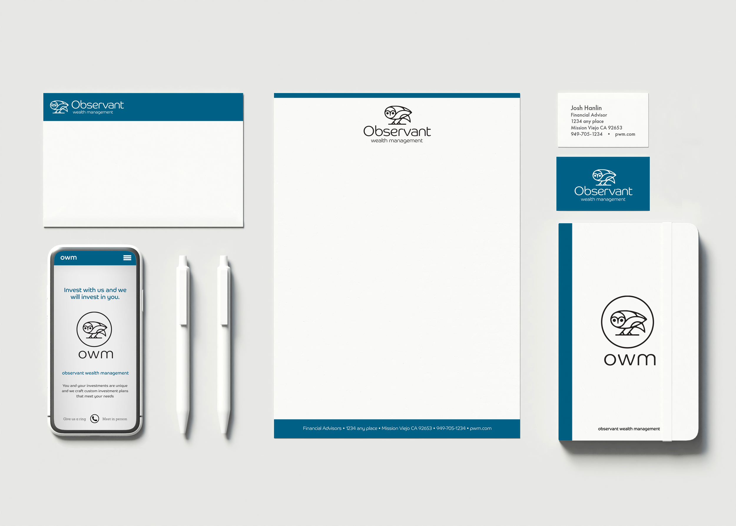
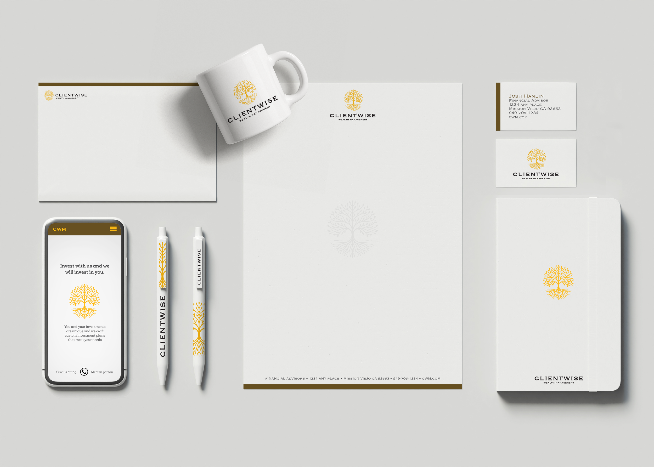
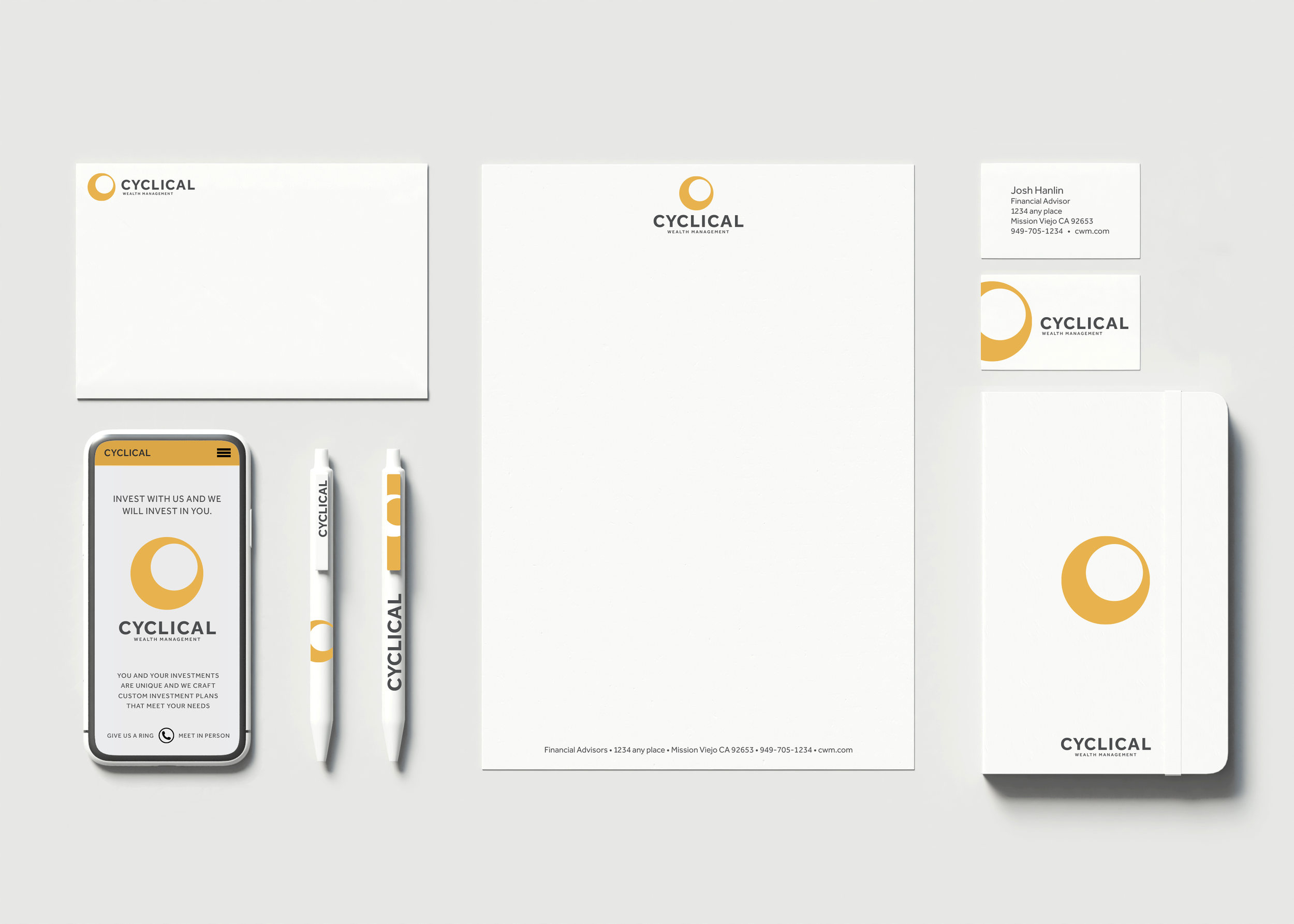
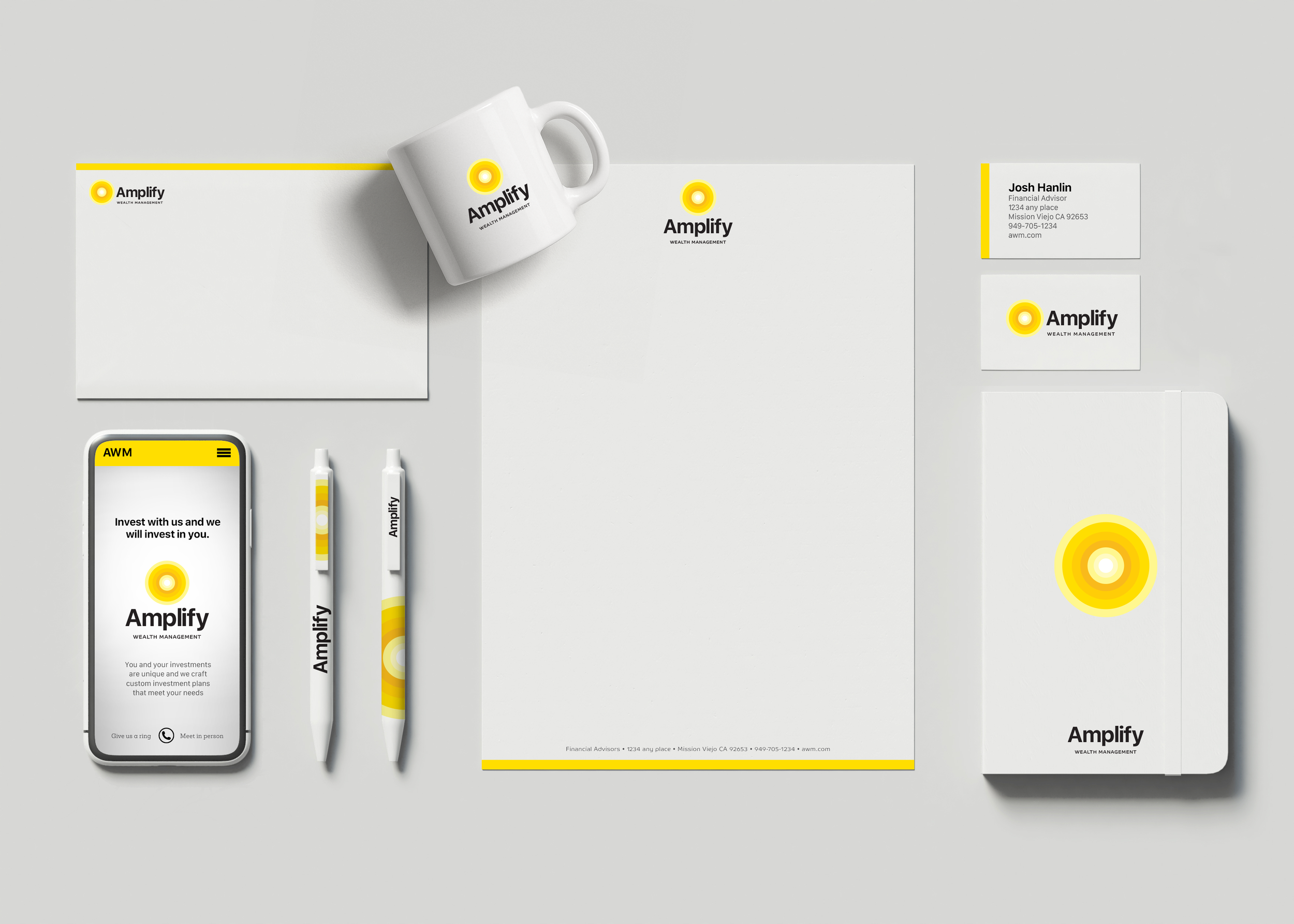
Brand Identity & Logo Development Overview

Working closely with a small client team, we spent several months developing a complete brand identity system from the ground up. The engagement began with an in-depth naming exploration, where we generated and evaluated multiple naming-convention options that aligned with the client’s vision, market position, and long-term growth goals. Alongside this work, we created a series of brand-identity comps—including logo concepts, iconography, color palettes, and early website layouts—so the client could see how each name translated across real customer-facing touchpoints.

Throughout the process, we conducted legal and trademark screening to ensure that both the name and the iconography were unique, protectable, and fully ownable for the client. This became a key educational moment, helping the client understand the value of distinctiveness in a crowded marketplace and how a strong, differentiated identity creates long-term equity.

After several rounds of refinement, we ultimately landed on the Amplify name and final visual identity—the version shown last in the progression. The attached mockups (letterhead, business cards, pens, mugs, mobile UI, and more) demonstrate how the system comes to life in a cohesive, modern brand kit.

This project showcases not just the final mark, but the collaborative, strategic process behind it—how I guide clients through naming, design exploration, legal considerations, and real-world application to create a brand that stands out, scales, and tells their story with clarity and confidence.

wealth management branding

BACK TO TOP
WORK